A Rebranding Story
I’ve always been a DIYer, even when it comes to graphic design, an area I have very limited experience in. My Once Again Sam logo was something I had developed with my husband years ago, when I first started the business and didn’t have much money to invest beyond basic supplies. The template I used to create the red "amoeba flower" logo was actually a drafting template I had left over from a landscape architecture course I took in college - I was using tools that were literally laying around my studio.
The logo worked for awhile. One of my very earliest jewelry collections featured layers of leather in the shape of my amoeba flower, but they didn't sell that well so I eventually dropped them, leaving the logo without much lasting meaning. I started to wonder if there was a better way to brand my growing business, and the tools laying around my studio in more recent months weren't offering any inspiration this time around.
I had been wanting to update my look for quite some time, but couldn’t come up with any fresh ideas in the graphic design department. I was stumped and I didn’t want to go through the major process of rebranding until I had something I really really loved, something that would take me through the next phase of my entrepreneurial experience. I kept waiting for that one good logo idea to come to me, but the good idea never came...except this one: hire a professional.
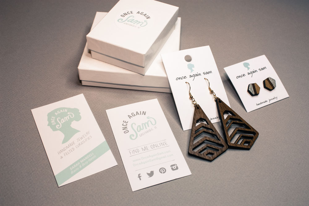
Chris Jones, the Creative Kingpin of Popcorn Initiative had some good ideas. Some great ones, actually! The first round of logo mockups were 1000 times better than anything I could have come up with. It was easy to see the difference between my DIY attempts and the work of a true professional. Chris developed several options, and I had a really hard time deciding which direction to go, because I honestly loved everything he sent. Each logo shared a different part of the Once Again Sam story (and there are a LOT of parts and pieces to the Once Again Sam story). I make a broad range of handmade items that have little to do with each other, which can cause problems when it comes to defining a brand with just one icon. How can you relate needle felted fiber art with handmade jewelry? The only thing they have in common is the person who made them.
In the end, after a few rounds of logos, I decided on one that would last, no matter how many new things I learn to make in the future (because I could take up woodturning tomorrow, and painting the day after that, and who knows what else the day after that). My new logo is simple, it’s just me, not a representation of what I make, or tools I use, or even a symbol that embodies my handmade business. Everything I create comes from the brain inside my head. Chris was clever with the typography too, because professional graphic designers are good like that - the little upward arrow on the end of “Sam” is a reference to where I got my start, using recycled materials, giving them new life, ONCE AGAIN, in a whole new way.
I couldn’t be happier with my new logo and branding package, and I wish I had done this a whole lot sooner. A huge thank you to Chris Jones of Popcorn Initiative for bringing Once Again Sam to this new level!